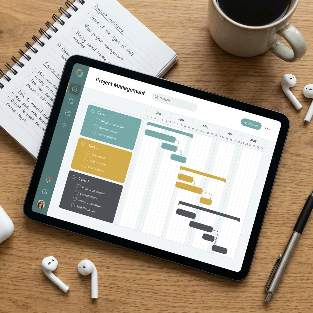
A good capacity view answers one question at a glance: Who is overcommitted, who has room, and when?
A simple approach is to combine project demand and team availability into a single weekly view.
To make this useful in practice, track capacity at the person-week level rather than only at the project level.
| Team member | Weekly capacity | Allocated | Utilization | Status |
|---|
| Alex | 40 hrs | 38 hrs | 95% | Healthy |
| Jordan | 40 hrs | 44 hrs | 110% | Overloaded |
| Sam | 32 hrs | 24 hrs | 75% | Available |
A few practices make the dashboard much more effective:
- Use a heatmap with weeks across the top and team members down the side. Color-code utilization:
- Green: 70–90%
- Yellow: 90–100%
- Red: Above 100%
- Reserve buffer capacity. Instead of planning everyone at 100%, target around 80–90% to absorb meetings, support requests, and unexpected work.
- Show work by project and role. Someone may be only 80% utilized overall but still be the only UX designer assigned to three simultaneous projects.
- Include upcoming work. Display at least the next 6–12 weeks so overloads are visible before they happen.
- Track planned vs. actual allocation. If actual effort consistently exceeds estimates, adjust future planning rather than expecting people to absorb the difference.
- Flag dependency bottlenecks. A single specialist shared across many projects is often the first source of burnout.
A typical executive dashboard includes:
- Overall team utilization.
- Capacity by project.
- Individual workload heatmap.
- Upcoming hiring or staffing gaps.
- Forecasted overloads for the next quarter.
If you're using tools like Microsoft Project, Jira, Asana, Monday.com, or Smartsheet, these metrics can usually be built into a live capacity dashboard that updates as project assignments change.